Today's Color Trends
Designers from major flooring manufacturer, Shaw Industries, have gathered and analyzed information from several recent markets, including the nationally renowned High Point International Home Furnishings Show. Here they share their findings:

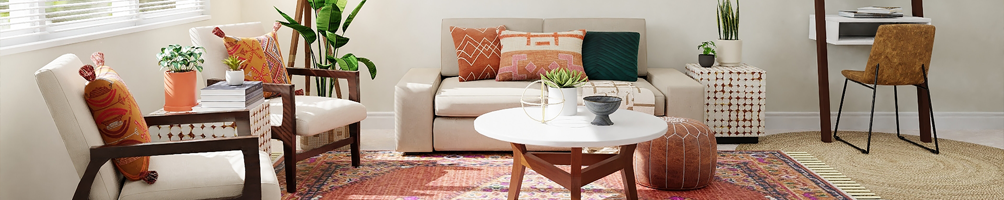
The Brights
“One of the exciting trends we’re seeing is the use of cleaner, brighter, clearer colors—coral, aqua, purple, and tomato red—as accents with subtle neutrals,” Morrow says. “You might call them ‘youth colors,’ although they’re being seen not only in kids’ and teen rooms, but in specialty rooms and as accents. It’s a happy trend signifying consumers’ cautious optimism.”
Hard Surface Stylist Sandi Graham echoes the optimistic observation.
“Greys are big in the market now,” she says, “but combined with happy, crisp colors, they are really fresh.”
White is also gaining traction. “White is an elegant color that makes a dynamic statement in wood or cabinets, and it’s coming on strong,” Graham says. “But not just plain white—this white has interest, shine, or texture, like a lacquered finish.”
Senior Stylist Jon Blumenaus noted that more striking colors at High Point were found in the Italian showrooms.
“What really stood out in these room settings was the use of bold splashes of rich accent color—reds, copper, and orange—in scatter cushions and wall art,” Blumenaus says. “Adding more space and depth was the use of sculpture-like lighting fixtures and large mirrors.”

The Neutrals
Designers also took a no-holds-barred approach to complex neutrals.
“Black, dark coffee-bean brown, and tinted grey seemed to be everywhere, set against soft, light beige and desert-tone wall covering and fabrics,” Blumenaus says.
And Morrow adds that “Italian design trends lead the rest of the design world.”

The Neutrals and The Brights … Together
Stylist Jada McCamy emphasizes the pronounced graying—and even “taupe-ing”—of colors. She notes that, while these neutrals and heading-toward-neutral colors are big, the bigger news is their combination with the unusual bright and clear, pale colors mentioned earlier.
She speculates that “perhaps we’re paving the way for pastels.”

The Patterns
Senior Stylist John Blumenaus says the look at the High Point show was “refined and uncluttered. One could see overall simpler lines and softer looks, compared to previous years. It looked like a more contemporary and more European-style influence was taking place.”
He notes that simpler lines have influenced home furnishing décor for some time, but now it’s slowly doing so in a softer and less dramatic way, moving away from previously popular stark, hard-edged design.
High Point produced several obvious pattern trends. Patterns appeared in more contemporary, organic, and sketchy designs, creating a more casual look. Color was used to express a mood and design statement by always being set against other color groups and embellished with delicate, medium- to small-scale patterns.
For bedrooms, the design statements were less busy than in years past. But there was still a considerable amount of pattern.
The patchwork use of color, patterned stacked cushions, and use of layered pattern-on-pattern with varying textures seemed to be everywhere. The combination created a cozy, homelike décor.
As to current trends’ effects on tile flooring, Stylist Sandi Graham points to a direction in tile design that has the “wow factor.”
“Patterned tile is a hot development,” she says. “And imagine tile with a damask design, done with wonderful subtlety. It’s beautiful.”
In conclusion, Shaw’s designers feel that the High Point show revealed more richness and life through added, intricate mixes of texture and luster and finishes. And they are equally excited to translate their findings into beautiful, stylish flooring options.